Relocation of job
Relocation of job
A relocation occurs when you move to another city or state for a job. People relocate for jobs every day for a variety of reasons. A relocation takes a lot of thought and planning. Fortunately, you can take certain steps to evaluate whether a job-related move is right for you. And, if it is, you can begin to plan for your next home.
A relocation occurs when you move to another city or state for a job. People relocate for jobs every day for a variety of reasons. A relocation takes a lot of thought and planning. Fortunately, you can take certain steps to evaluate whether a job-related move is right for you. And, if it is, you can begin to plan for your next home.
MOBILE . TABLET - WEB
Orchestrating a Cross-Platform Financial Command Center


My Role:
Lead UX Designer & Mentoring
Timeline:
Feb 2019 (5months)
Directed a 2-person design team from vision to execution, establishing a cohesive design strategy and aligning with cross-functional stakeholders across product and go-to-market teams to transform customer insights into scalable product transformations.
How a 5-month design strategy unified fragmented personal wealth data across mobile, tablet, and web—driving 62% daily engagement and reducing engineering build times by 65%.
IMPACT
-
Daily engagement increased substantially — the digital-first mobile experience now drives an estimated 62% of daily active engagement.
-
A unified design system cut future build time by an estimated 65%, compounding value for every subsequent feature shipped.
-
Users gained at-a-glance financial self-awareness — balance, income, and savings trends are visible in a single screen with no digging.
-
Behavioral patterns invisible in monthly summaries (a heavy Friday, a slow week start) became visible through weekly activity charts, reinforcing trust in the product.
This project created a unified financial management experience that gave individuals complete visibility into their money across every account, category, and time horizon. The digital-first mobile experience drives around 62% of daily active engagement, with the design system cutting future build time by an estimated 65%.
CONTEXT
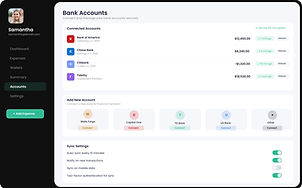
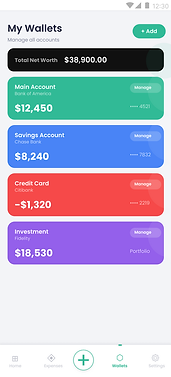
FinanceApp Dashboard is a personal finance management platform designed to give individuals complete control over their money — from daily transactions to long-term investment growth — in a single, always-visible interface.
The dashboard serves as the command centre. At a glance, User can see her total balance of $24,563, track that her monthly income is up 5.1%, catch that her expenses are slightly down, and confirm her savings are growing at 8.7%. No digging. No switching between apps. The numbers that matter are front and centre, every time she opens the product.
The weekly activity chart separates income from expenses day by day, making patterns visible that a monthly summary would hide — a heavy Friday, a quiet weekend, a slow start to the week.
The spending donut breaks down where the money is actually going: 35% to shopping, 28% to food, 24% to housing. The balance trend line across six months shows a dip in December and a steady climb since January — the kind of honest, unfiltered picture that builds financial self-awareness over time.
The product exists because most people do not have a clear picture of their own finances. They know roughly what they earn. They have a vague sense of what they spend. But the gap between those two numbers — where it goes, whether it is growing or shrinking, whether the habits of this month are better or worse than last month — stays invisible. This dashboard makes that gap visible, persistent, and actionable.
How a 5-month design strategy unified fragmented personal wealth data across mobile, tablet, and web—driving 62% daily engagement and reducing engineering build times by 65%.
From insight to action
The Problem:
-
Most people don't know where their money goes each month. They feel anxious about finances, avoid checking their bank accounts, and discover overspending only after it's too late.
-
Anxiety around money leads users to avoid checking accounts altogether, so overspending is often only discovered after the fact.
-
Financial data is fragmented across separate apps and accounts, forcing users to dig and switch context just to answer simple questions.
-
No single, always-visible view existed to compare income, expenses, and savings trends across daily, weekly, and monthly horizons.
Constraints
-
Small team: a 2-person design team had to cover strategy, execution, and cross-functional alignment within a 5-month timeline.
-
Had to align a single design strategy across three distinct surfaces — mobile, tablet, and web — without fragmenting the experience.
-
Broad financial products (e.g. generic "Personal Loan") had to be deconstructed into specific, relatable use cases without adding complexity to the underlying system.
-
Stakeholder alignment was required across both product and go-to-market teams before customer insights could become scalable product changes.
Solution
FinanceApp closes this gap by orchestrating fragmented financial data into a single, high-signal command centre that replaces anxiety with actionable clarity. At a glance, users instantly see their systemic health—total balance, income trends, and savings metrics—without the cognitive load of app-switching or data-digging. By visualizing daily behavioral patterns through weekly activity charts and tracing long-term trajectories across a six-month trend line, the dashboard makes previously invisible spending habits completely visible, persistent, and under control.


Strategic Simplification on Mobile
For the mobile ecosystem, the strategy centered on reducing cognitive load by orchestrating highly guided, contextual journeys. Trust and confidence were established by prioritizing user control and clear, 'safe-to-fail' choices within a constrained viewport. We deconstructed broad financial products into specific, relatable use cases—shifting from a generic 'Personal Loan' to highly relevant products like holiday funding or electronics financing. By segmenting the experience with tailored, accelerated flows for specific professional profiles, we simplified the underlying complexity and optimized the architecture for instant scannability."


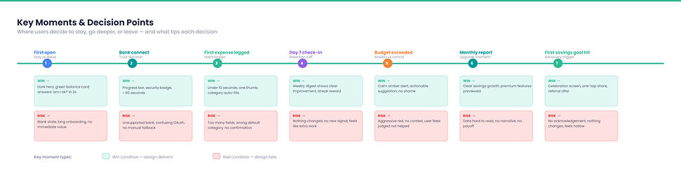
Customer flow
We approached the customer journey not as a simple linear path, but as a dynamic ecosystem of touchpoints. Recognizing that financial decisions rarely happen in a single session—users might research on a desktop, check balances on the go, and act on a push notification—we orchestrated the journey to feel continuous across every surface. By mapping these transitions, we identified where context was previously lost and designed proactive, guided handoffs. The result is a cohesive system that remembers the user's intent, transforming a fragmented financial process into a seamless narrative.


Elements & Iconography
Operating as a unified visual language, the system's elements and iconography strip away visual noise to deliver consistent, predictable clarity across every platform and context.

Impact
-
Daily engagement increased substantially — the digital-first mobile experience now drives an estimated 62% of daily active engagement.
-
A unified design system cut future build time by an estimated 65%, compounding value for every subsequent feature shipped.
-
Users gained at-a-glance financial self-awareness — balance, income, and savings trends are visible in a single screen with no digging.
-
Behavioral patterns invisible in monthly summaries (a heavy Friday, a slow week start) became visible through weekly activity charts, reinforcing trust in the product.
Learnings
-
Users don't need more data — they need fewer places to look. Consolidating scattered numbers into one command centre mattered more than adding new features.
-
Segmenting flows by relatable, specific use cases (holiday funding, electronics financing) reduced perceived complexity more effectively than simplifying the generic product itself.
-
A reusable design system paid for itself quickly — the 65% reduction in future build time came directly from investing in shared components early.
-
Designing for continuity across desktop research, mobile check-ins, and push-notification actions mattered as much as any single screen — financial decisions span sessions, not just screens.